Why Most Ophthalmology Websites Fail to Convert Patients (And How to Fix It)
A Modern Ophthalmology Website Should Convert, Not Just Inform
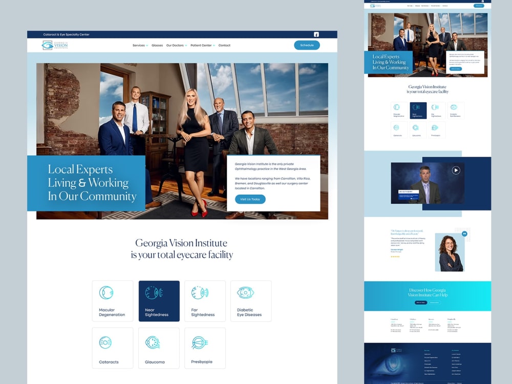
A modern ophthalmology website should do more than show your logo and phone number. It needs to book appointments, educate visitors, and build trust. Yet many clinics unknowingly repel potential patients. Here’s why your eye-care site may be underperforming and how to turn it into a conversion machine.
1. Vague Messaging Instead of a Clear Promise
Patients don’t choose your practice because you list “comprehensive eye exams.” Generic language doesn’t differentiate your clinic. Update your homepage headline to clearly communicate what makes you unique, and emphasize outcomes rather than services.
Example: “Personalized cataract care using advanced lasers”
Tip: Lead with the result patients want (clearer vision, comfort, confidence, faster recovery)
2. No Obvious Call to Action
Many ophthalmology sites hide appointment links at the bottom of pages or inside drop-down menus. Every page should include a clear call to action, placed above the fold and repeated after major sections.
Use a high-visibility button label such as “Book Your Eye Exam” or “Schedule a Free LASIK Consultation”
Place CTAs in the header, hero section, and near service descriptions
3. Written for Google, Not Patients
SEO matters, but keyword-stuffed copy turns people away. Patients want empathy and clarity, not jargon. Write in plain language and address common symptoms and concerns.
Instead of: “Full-service optometry clinic”
Try: “Blurry vision? Dry eyes? We’ll help you find relief.”
Human-friendly copy improves trust and can still perform well in search.
4. Too Much About You, Not Enough About the Patient
Credentials and technology matter, but only when tied to patient benefit. Shift your messaging from features to outcomes.
Feature: “We use the latest OCT technology”
Benefit: “Advanced OCT helps us detect problems early so you can protect your vision”
5. Slow and Unfriendly on Mobile
More than half of website traffic comes from mobile devices. If your site loads slowly or breaks on small screens, you lose patients.
Compress and properly size images
Simplify layouts for small screens
Use responsive design so CTAs stay visible and easy to tap
Aim to keep Largest Contentful Paint under 2.5 seconds
6. Ignoring Accessibility and Trust Signals
As an eye-care provider, your website should be usable by people with visual impairments and should build trust quickly.
Use high-contrast colors and larger, readable fonts
Ensure screen-reader support (clear headings, labeled buttons, descriptive alt text)
Display authentic patient testimonials prominently
Highlight credentials, affiliations, awards, and certifications
If you include before-and-after photos, obtain written consent and follow privacy requirements
7. Missing Online Scheduling and Secure Forms
Modern patients expect to book online. Make scheduling and forms simple, secure, and easy to find.
Add an online scheduler that allows patients to choose a date and time
Encrypt all patient data and use secure, compliant forms when collecting sensitive information
8. No Educational Content or Membership Information
Patients often research conditions before booking. Educational content builds trust and improves search visibility.
Add short articles or videos on cataracts, glaucoma, LASIK, and contact lenses
If you offer membership plans or vision subscriptions, create a dedicated page explaining what’s included and why it’s valuable
Quick Fixes You Can Implement Today
Rewrite your homepage headline to emphasize patient benefits
Add a contrasting “Book Now” button to every page
Simplify navigation with clear categories (and add a search bar if the site is large)
Compress images and test your site on a mobile device
Collect testimonials and display them prominently
Integrate scheduling and ensure all forms are secure
Final Word
Patients judge your clinic long before stepping into it. By avoiding generic copy, adding prominent CTAs, ensuring mobile-friendly and accessible design, and including trust-building features, you can turn your ophthalmology website into a powerful conversion engine.
Powered by Froala Editor
You May Also Like

बस्ती: शांति भंग की आशंका में तीन युवकों का चालान

Basti: बलात्कार के वांछित अभियुक्त को कलवारी पुलिस ने किया गिरफ्तार

New Sainik School Opened: 100 नए सैनिक स्कूलों पर फिर जोर: रक्षा मंत्री राजनाथ सिंह ने ट्वीट कर दी जानकारी

श्रीलंका ने अमेरिकी युद्धक विमानों को लैंडिंग की इजाजत नहीं दी, राष्ट्रपति बोले- हमारी जमीन किसी हमले के लिए इस्तेमाल नहीं होगी

UP TET 2026 का विज्ञापन जारी: 27 मार्च से आवेदन, 2 से 4 जुलाई तक होगी परीक्षा